A typical design project begins with a product manager outlining functionalities as user stories in a product requirements document. By consuming PRD, the design team begins to comprehend the company’s business needs and the issues the product seeks to address for its intended users.
1 | Setting up the Questionnaire
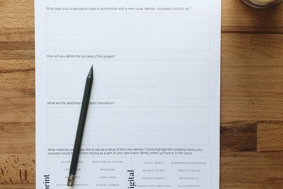
User interviews are a common research method used to gain a better understanding of the users’ behavior, needs, and pain points. Designers prepare a questionnaire to inquire about specific aspects of users’ lives such as their lifestyle, pain points, needs, and motivation regarding the problem we are attempting to solve.
A questionnaire is a collection of questions that are typically used for research purposes and can be both qualitative and quantitative. During interviews, it is a good practice to ask follow-up questions that begin with “Why?” and to elicit stories from users’ previous experiences. Carry a UX Journal with you during interviews to refer to if you forget anything and to take notes.
2 | Analysis and Capturing Findings

It is now possible to make sense of our study data after performing this series of user interviews with our intended audience. All of our research data up to this point has been dispersed at random across publications, recordings, and our minds. Our observations and user statements were recorded on sticky notes to compile everything in one location and facilitate analysis.
Affinity Mapping is a technique that aids designers in identifying shared user behaviors and pain points to address significant and frequent problems that users encounter. In this instance, we record our findings in the UX Journal and group them into clusters.
3 | Creating User Personas & Scenarios
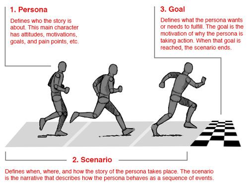
Following affinity mapping, behavioral patterns start to emerge that reveal more about the user groups we are creating for. The fictional characters known as “user personas” were developed based on user research to reflect the various user types who will use the service, product, or application. Effective personas create a clear image of the lifestyle, pain points, motivations, desires, and ambitions of the main user groups for your apps.
We have a very decent understanding of the personality traits and objectives of our users once we’ve created User Personas. But we are overlooking the circumstances and scenarios in which people will encounter problems or use our product. Understanding the “context” of social and environmental factors helps us empathize with our users more. Storyboarding allows for the textual and graphic documentation of user scenarios.
4 | Creating Task Flows
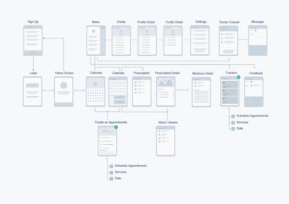
Task Flows assist us in concentrating on only Those merely flow diagrams, with the major goal being to match them up with users’ offline experiences and real-life journals, as well as to make use of interaction design principles like Hicks Law to lessen cognitive user load during each encounter.
5 | Defining Information Architecture
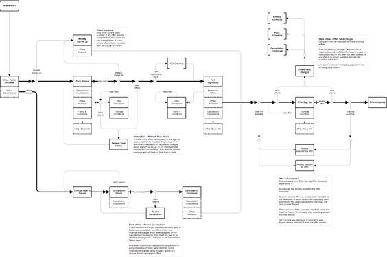
Degrees of access must be established for mobile interactions, where users have a limited amount of screen space to interact. It is crucial to prioritize and give users only the information they need, guiding them step by step to accomplish their objectives. The information structure is defined at this point by creating a sitemap.
6 | Wireframing and Heuristic Evaluation
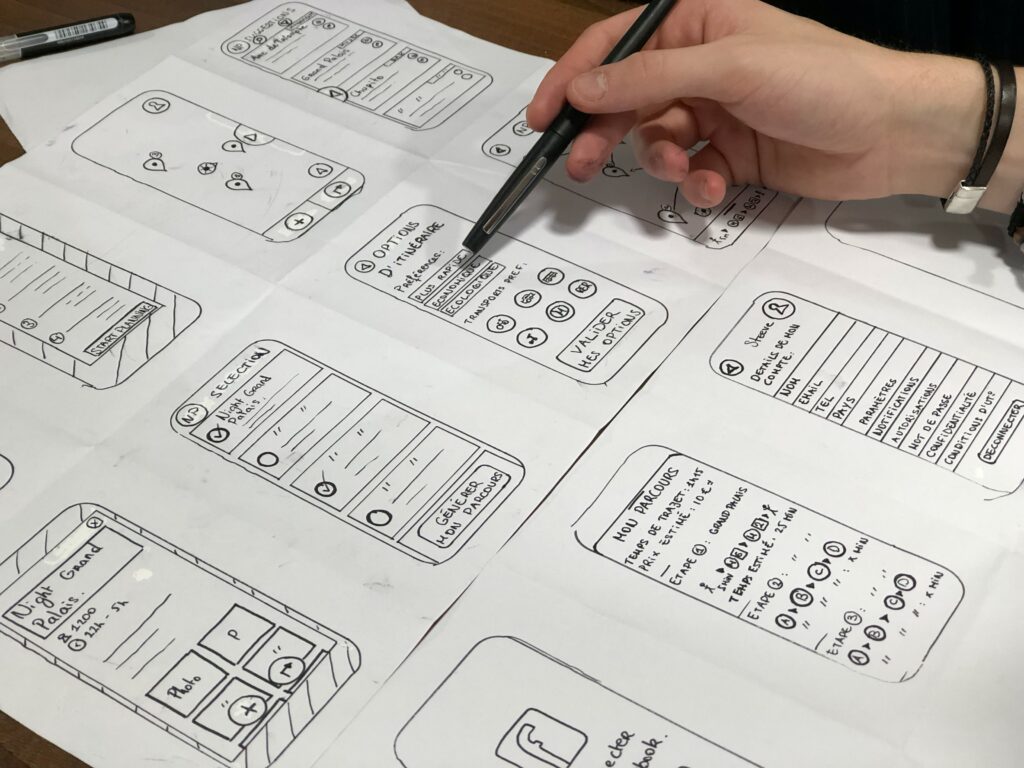
The structure is now transformed into a skeleton. A UX designer makes wireframes of their application on paper to quickly iterate, similar to how an architect first draws a layout of the entire building before considering pouring cement and interior design. Every design choice made in this instance is based on the user personas, their needs, and the usage scenario.
Jakob Nielsen’s set of principles for heuristic evaluation aid designers in determining the most stupid errors they make at this stage. These recommendations aid designers in determining the usability of any interface.
7 | Picking Color Combinations
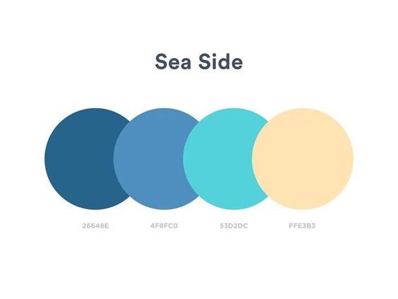
We now move on to the surface component of the design process, where our attention is on the emotional aspect of the design, after taking care of the usability in our design. According to color psychology, different hues evoke various feelings in their viewers.
In our application, colors can be used to link our product to specific feelings and emotions that we wish to arouse in the minds of our users. In this instance, it is crucial to understand color psychology.
8 | Choosing Typography
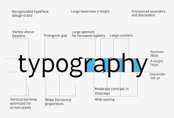
Typography is the practice of placing a type in a way that makes it legible, readable, and visually beautiful when it is shown. In the real world, typography is all around us, helping us to make sense of events. For users to accomplish their objectives more quickly, the text in our application needs to be readable. Expressive typography is a different aspect of typography.

Leave a Reply